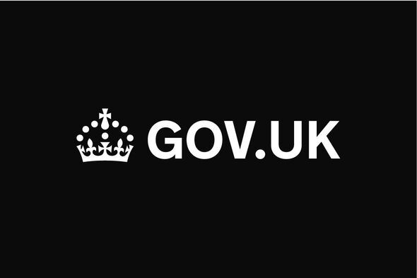
Brits have criticised a new government logo as they find out how much was spent on the redesign.
TheGov.UK website, used by millions for important services such as passport renewals and registering births, deaths and marriage, will see its masthead changed from black to blue and its 'dot' coloured turquoise. The contracts were awarded to the global ad agency M&C Saatchi and the final cost was around £532,000, the government has confirmed.
However, critics say the logo refresh is little more than changing a colour and moving a dot so they are unable to justify the cost. The new logo is set to go live this week and it has been slammed by users on Reddit.
One person shared a photo of the redesigned logo and wrote: "GOV.UK is getting a 'brand refresh' on 25 June, with updates to the logo, header bar (changing from black to blue) and footer (a black crown added to the top)." One user commented: "I really get annoyed when organisations get conned by consultants, or sometimes a new management team, to replace a perfectly acceptable logo. What a waste of our money."
Another added: "Personal opinion, but I prefer it as it currently is. Why even do a redesign in the first place? It was already looking professional and correct, but of course more money has to be wasted on something irrelevant."
A third chimed in: "So, we've moved the . to the middle for some weird reason, and made it cyan. Someone got paid far too much to mess around without something that was completely fine?"
A fourth said: "Yay, typical government wasting money on things that don't need change."
However, there were some positive comments as well. A different Reddit user noted: "I must say, the website has improved so much over the years. You can tell care has gone into every decision made."
A second shared: "I've only used it a few times but it is actually fantastic. It's almost strange how good it is compared to other things in this country. A success that should be celebrated."
A government spokesperson said of the new logo: "This was committed to by the previous government, with two of the three contracts signed and delivered by July 2024. The new government then chose to turn the rebranding and research work into consumer-friendly digital products, including our upcoming GOV.UK App, GOV.UK Chat and more."
The Gov.UK Design System has shared some more information about the rebrand on its website. It stated: "From 25 June 2025, a new brand and visual identity will be introduced to GOV.UK and products and services provided by DfE."

It mentioned that the initial changes to the brand identity are the gov.uk header, gov.uk footer, service navigation and the cookie banner. This new identity will be used across all GOV.UK website pages, GOV.UK Notify, GOV.UK Pay, GOV.UK Forms, the GOV.UK App and social media.
The Design System confirmed that the updated Gov.UK header component "uses blue as the background colour instead of black, uses a refreshed GOV.UK logo and wordmark lockup and extends to a height of 60px, instead of 50px with a 10px bottom border."


